
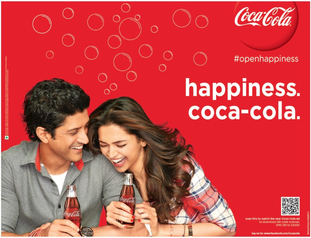
The purpose of this reverse engineer post is to show the use of contrast, repetition, alignment, proximity, and color in a design. This is an advertisement photo for Coca Cola’s, “Open Happiness” campaign. I wasn’t able to find this photo on Coke’s website, but I found this photo on the following website: https://www.crazyegg.com/blog/7-paths-persuasion/ .
Joe Tripodi was the chief marketing and commercial leadership officer over this campaign. Tripodi said “Open Happiness builds on that heritage, recognizing that even with the difficulties and stress of modern-day life there still are opportunities, every day, to find a moment to recognize life’s simple pleasures. This new campaign reminds people that Coke is always there to offer that small moment of fun and refreshment when you need it.”
Contrast
This whole photo is a great example of contrast. the white on a red background just captures the eye and really brings out the message of this photo.
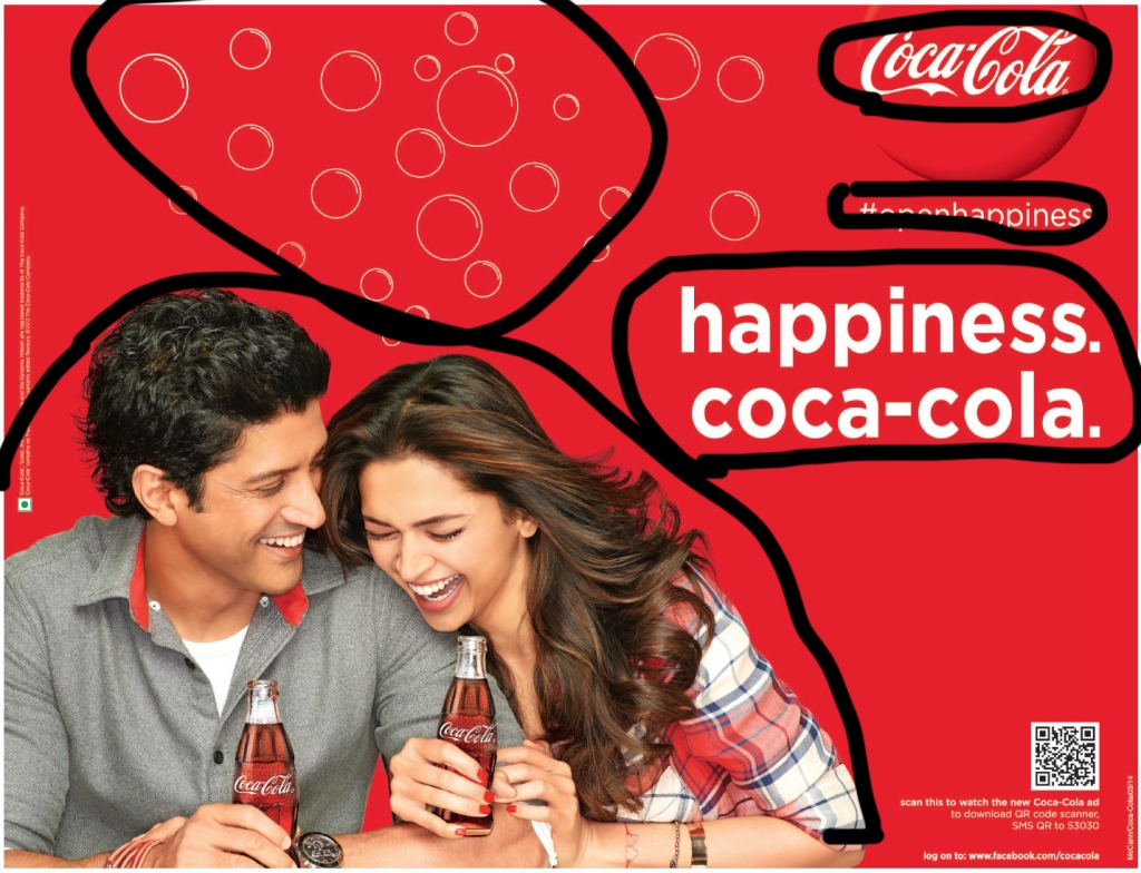
Repetition

Each repeated circle is an example of repetition. According to the book The Non-Designer’s Design Book: Fourth Edition by Robin Williams, “A repetition of visual elements throughout the design unifies and strengthens a piece by tying together otherwise separate parts.” The name brand Coca Cola is also an example of repetition. It is repeated frequently throughout the design.
Alignment
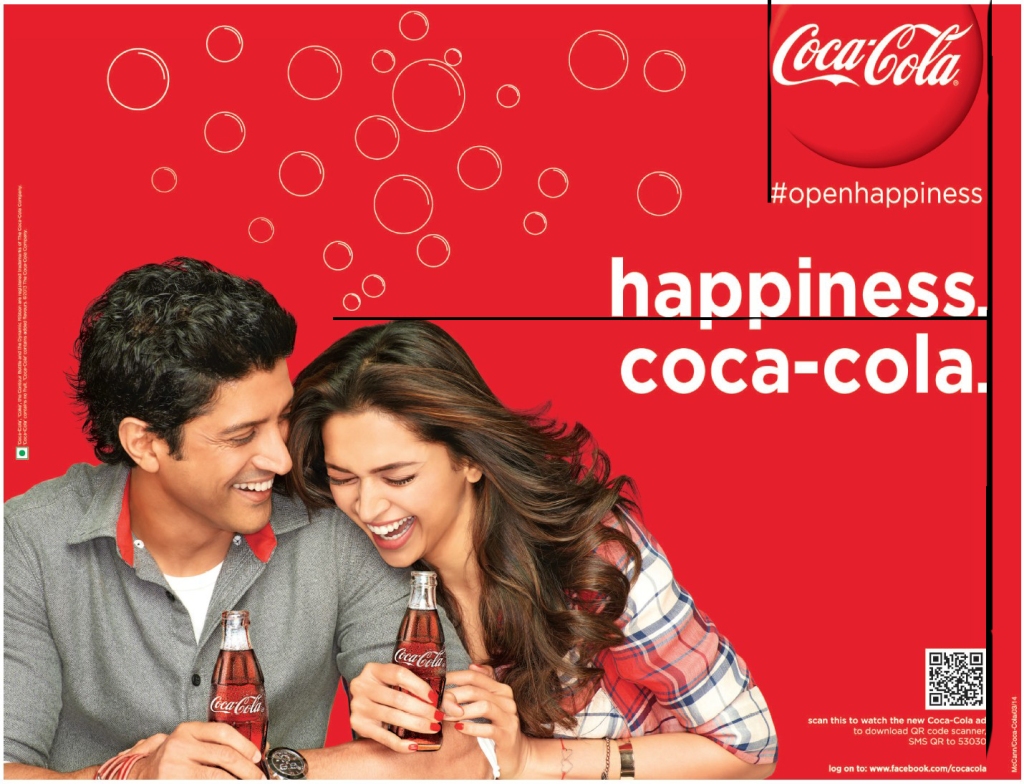
The type in this photo is aligned to the right. The periods at the end of “happiness” and “coca-cola” are aligned with the barcode. the word happiness is aligned with the top of the girl’s head. The hashtag at the beginning of open happiness is aligned with the coca cola circle above it.
Proximity
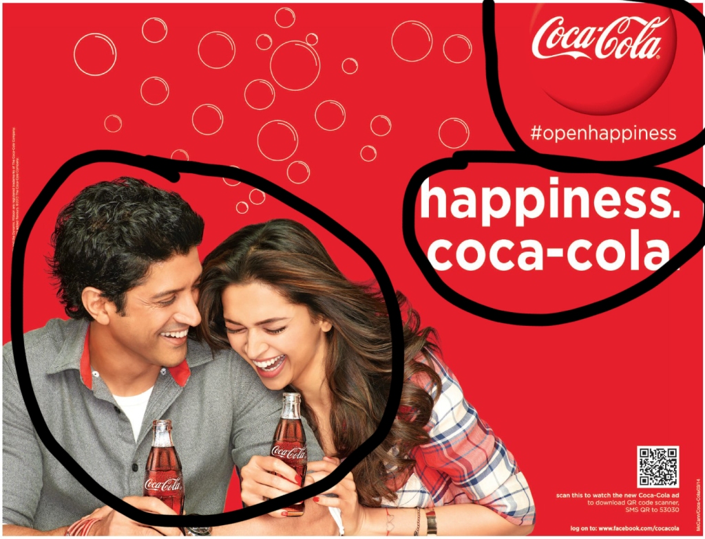
The book The Non-Designer’s Design Book says ” The Principle of Proximity states: Group related items together… physical closeness implies a relationship.” Because of the closeness of the two people, you can tell that they are a couple. With happiness and coca-cola so close toether, you can assume that they are saying coca-cola brings happiness. If they were separate, it wouldn’t mean the same thing. Also, having #openhappiness close to the logo Coca-Cola makes you assume that when you open a Coke, then you open happiness.
Color
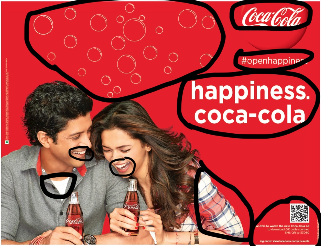
The two strong colors in this ad are the white and red. I have noticed that this is consistent in almost all Coke ads. In this ad they ad both models wear white, and also had the typeface white. The white also shows of both of their smiles which goes with the theme “open happiness”. The red in this ad is very consistent as well. The whole background is red and both models have red on their shirts. The girl even has red fingernails which brings your eyes to her hand which is holding the Coke.
Conclusion
Contrast, repetition, proximity, and alignment are key elements in a good design. Color is a great way to use as a contrast or repetition in a design. This Coke advertisement is a great example of a well-done design.
