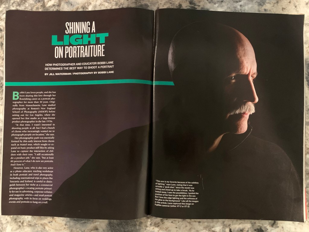
This article is from Digital Photo Magazine. It is a great example of using both photography and typography. This issue is mostly about photographing portraits. The article was written by Jill Waterman and the photographer is Bobbi Lane. Bobbi is an award-winning commercial photographer from Massachusetts. She travels the world leading international photography workshops. She offers online classes and has written and published two books on photography principles.
Category Identification
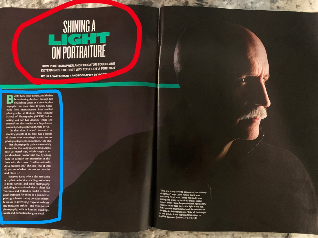
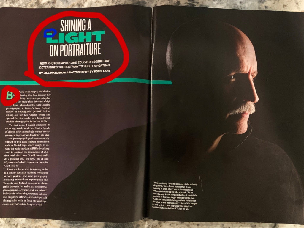
The font circled in red is Sans Serif. You can tell because there are no serifs and no thick or thin transitions in the strokes. The font circled with blue is an Oldstyle font. It is Oldstyle because of the diagonal stress in the letters. The serifs on the lowercase letters are slanted and the curve is bracketed.
Contrast
The typography contrasts because of the uses of the two different categories: Oldstyle and Sans Serif. They also use contrast in this magazine example by having the Sans Serif in Bold. It is also contrasting because of the uses of the green and white in the typography.
Photography
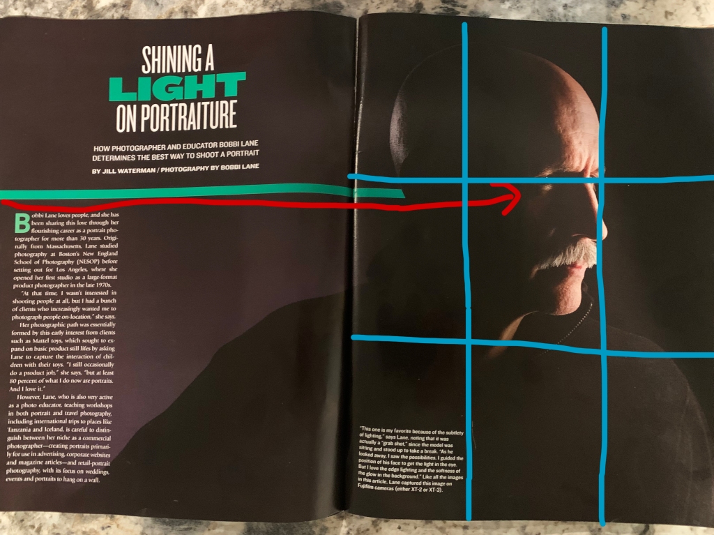
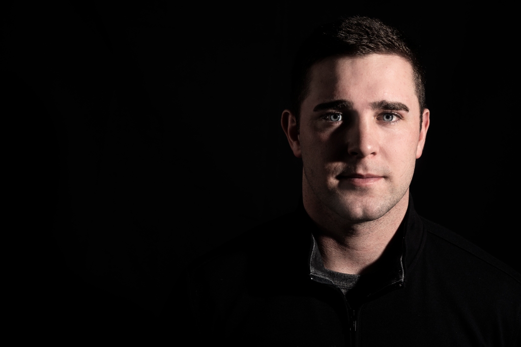
The red line shows how the green line in the design uses the principle of “leading lines” by directing your eye to his eye. I would say the line of lighting on his nose acts as a leading line to his eye as well. If you just look at the second page, his eye is right on the rule of thirds line.
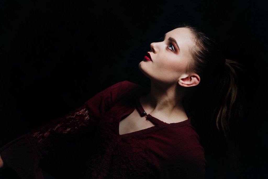
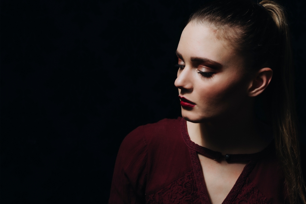
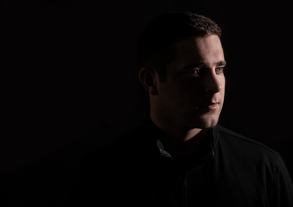
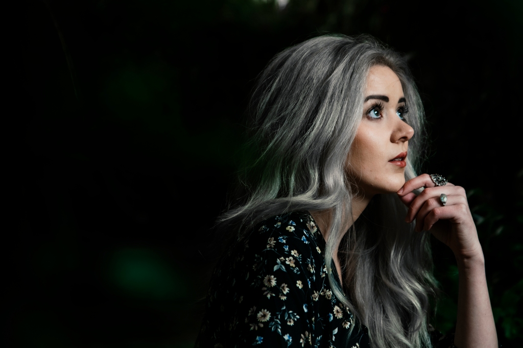
Alternate Images
These images could definitely substitute the one in the magazine. They use the rule of thirds, and are all studio photos. These were shot in my homemade studio. I used a Nikon D750 and Godox AD200 for the light. They have a lot of contrast just like the one used in the magazine.
These first two images are self-portraits. I set my camera on a timer and ran in front of the camera for these!
This photo below is a photo I took of my Husband in my studio. This one replicates the photo in the magazine very well.
This last photo would work as well. It would especially bring in the green from the design of the page.
