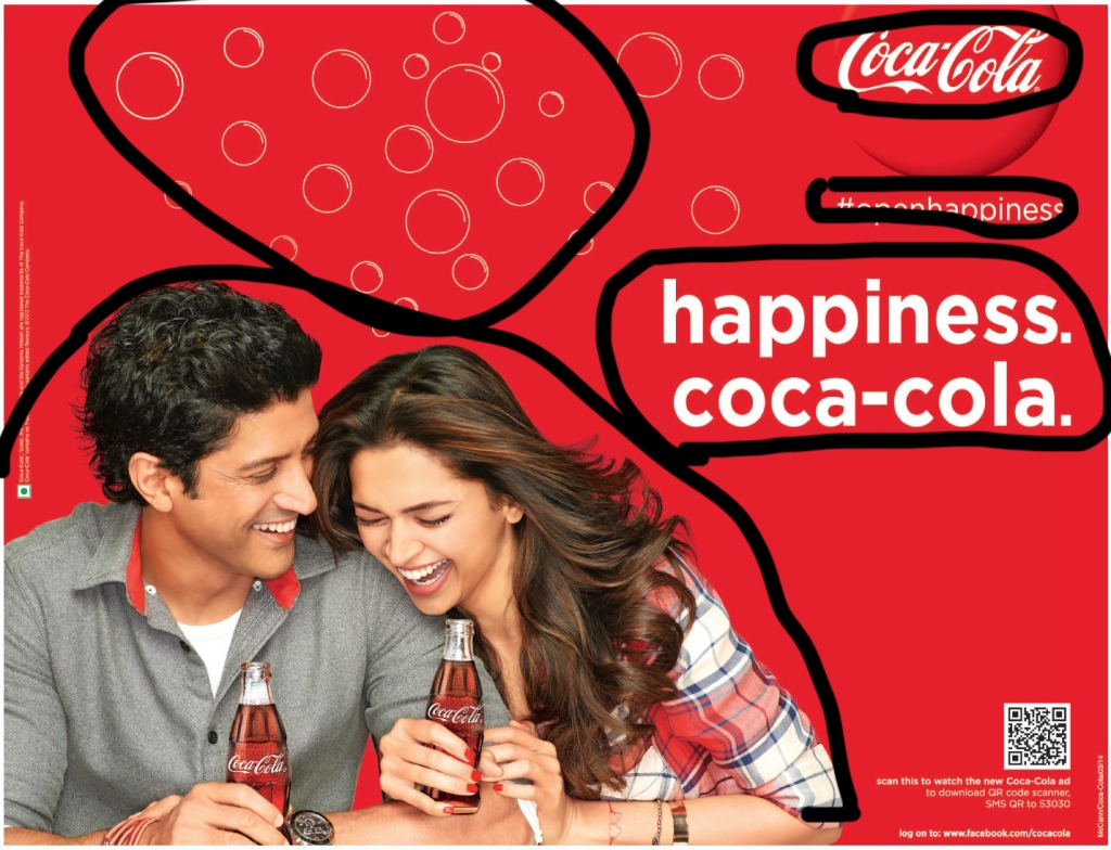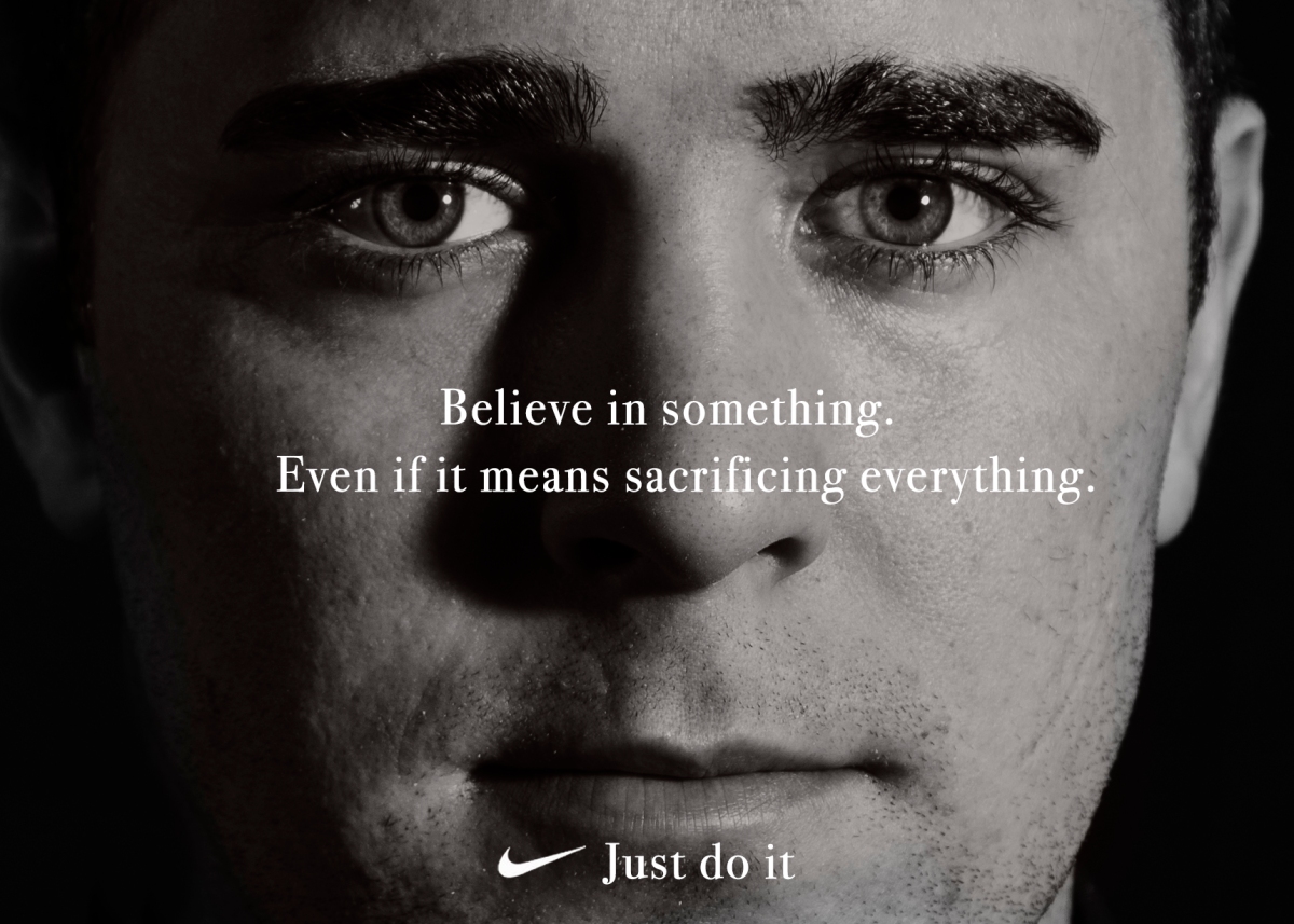
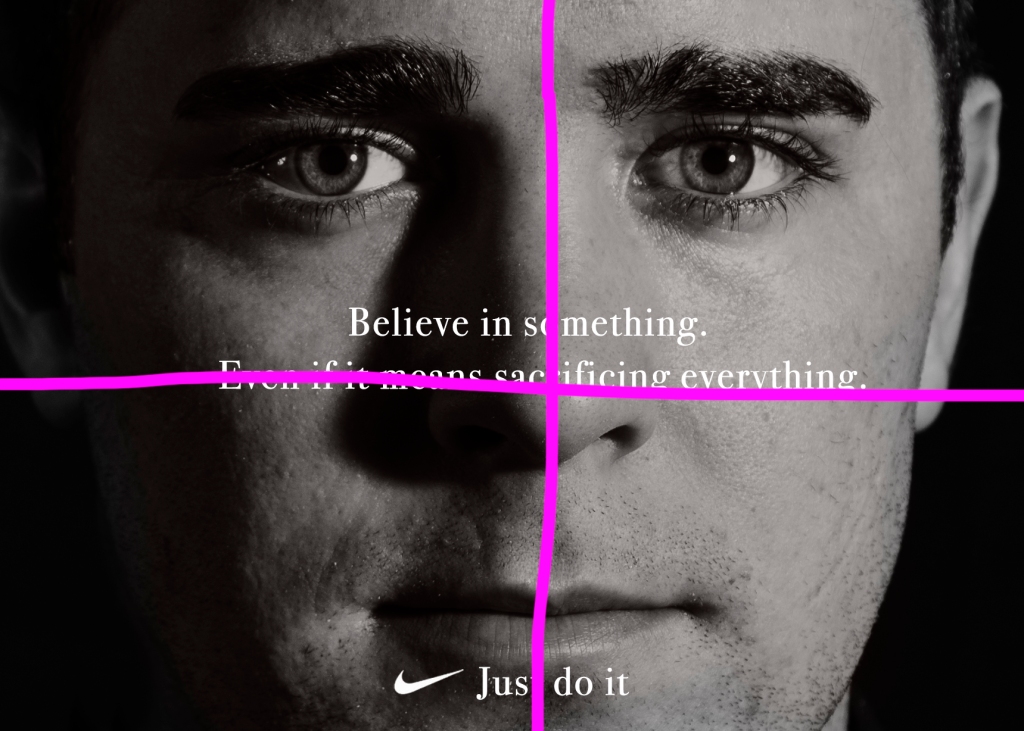
This is an Ad campaign one by Nike. It was in support of what Colin Kaepernick did to protest police brutality and racial injustice. He did this by taking a knee during the national anthem at a football game. (I absolutely do not support his actions in this. I chose this advertisement for design purposes only. I found this ad on this website: https://www.businessinsider.com/25-nike-ads-that-shaped-the-brands-history-2013-8#colin-kaepernick-and-just-do-it-2018-26.
Alignment
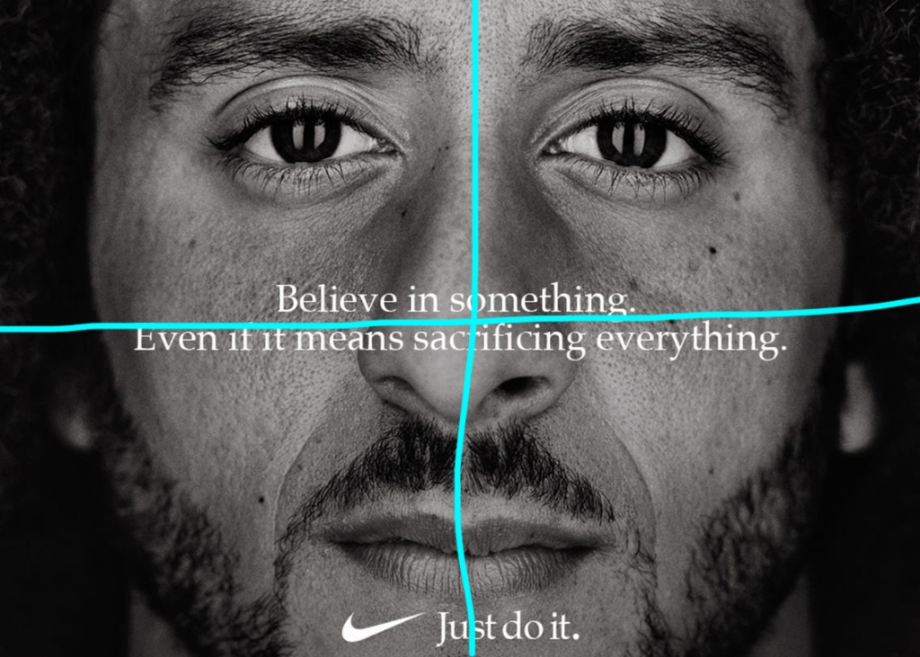
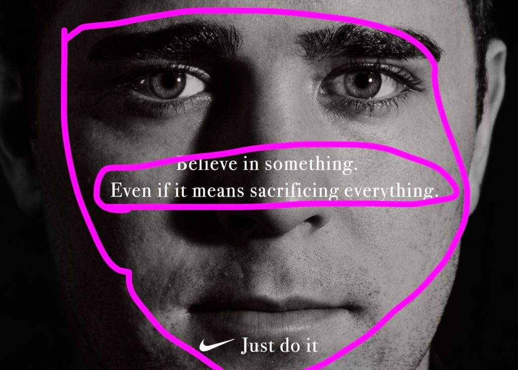
The advertisement is all aligned in the center. The text in the middle is aligned with his face and is centered vertically and horizontally. The nike symbol and the “Just do it.” at the bottom are aligned in the bottom center as well.
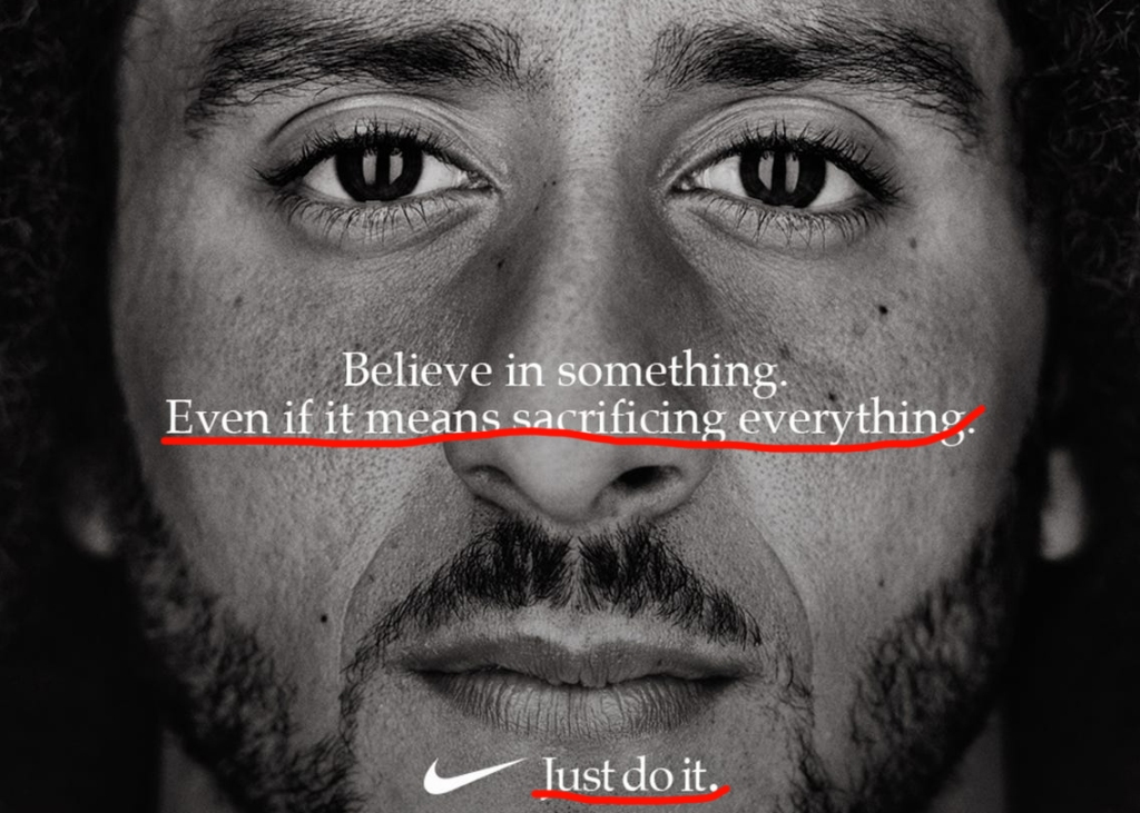
Contrast

The type is white which is contrasted with the black. The colors are contrasting as well with the white and black.
Repetition
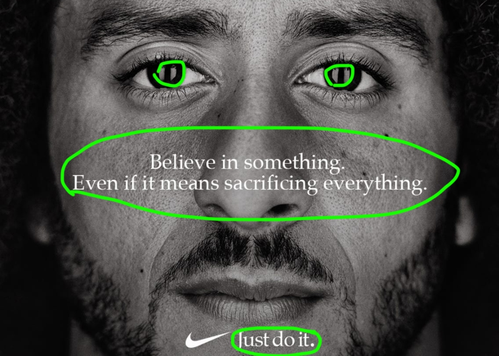
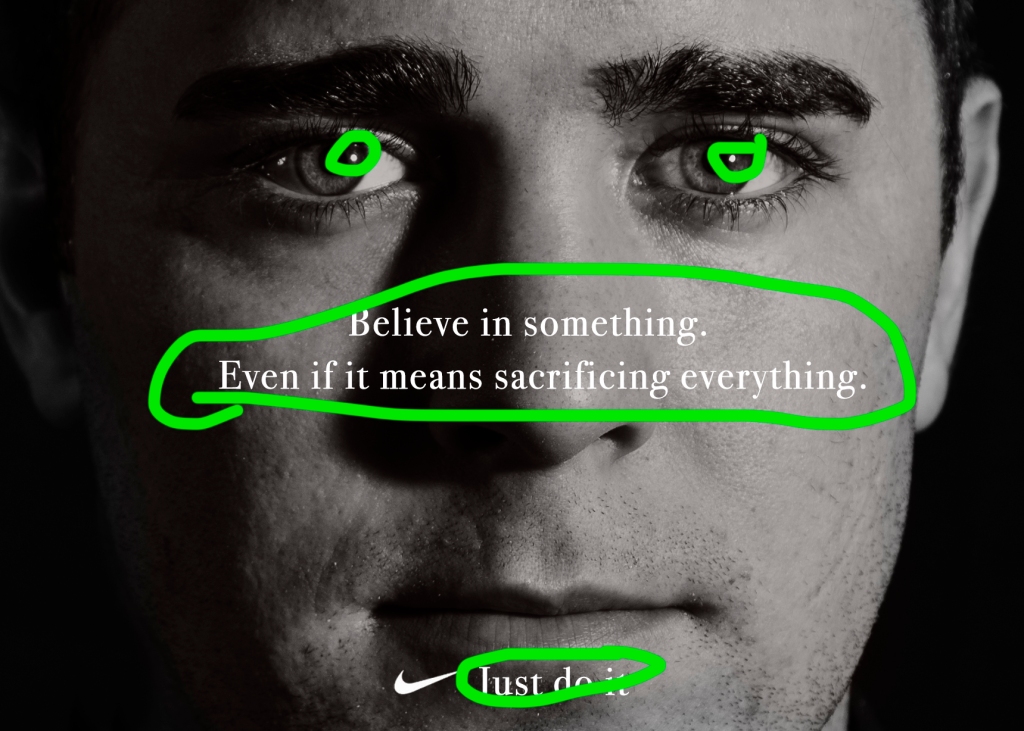
Repetition is used in the typography. The same typography is repeated in all three sentences. The lighting in his eyes are repeated as well.
Proximity
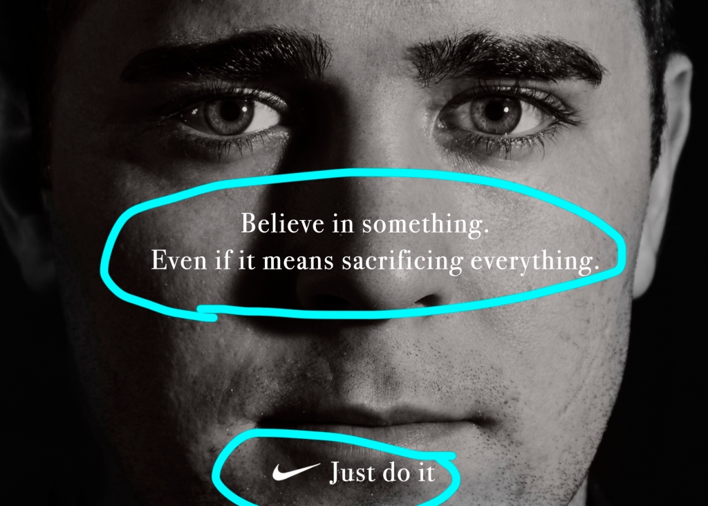
The proximity of the first two sentences show that they are supposed to be read together. Having the three sentences over his face show that it is supposed to represent Colin Kaepernick.
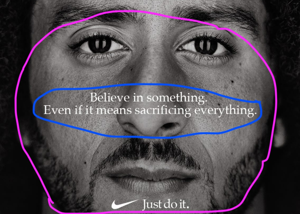
Color
By using black and white, it gives the advertisement contrast. It is a dark photo and leads the eyes to the white in the ad. So first the eyes capture your attention, and then the next two sentences, and then the last one, “Just do it”.
Typography

The same typography is used in all three sentences. It is an Oldstyle font.
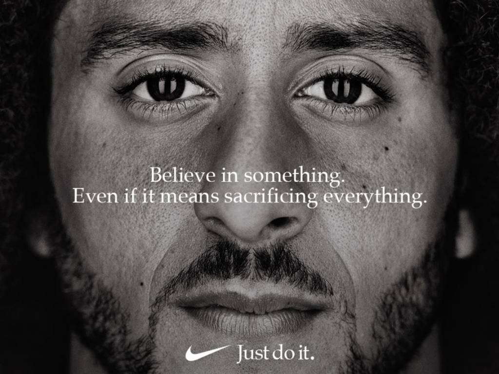
New Ad

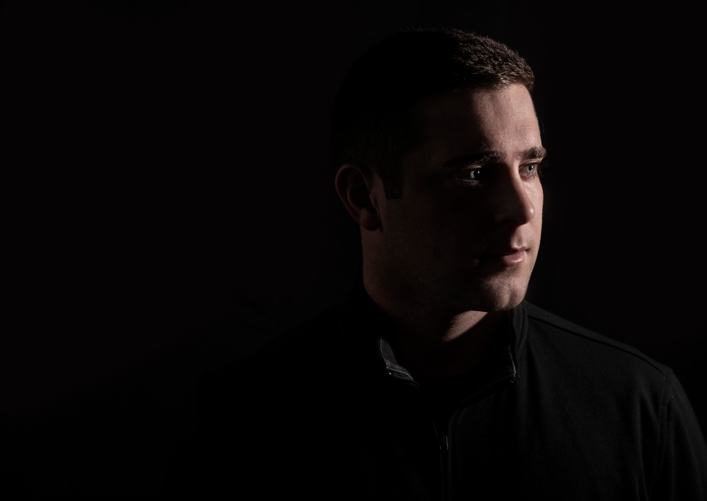
This is a photo I took of my husband in my studio. I copied over the Nike symbol from the original Nike advertisement.
Alignment
All design principles are the same as the ones in the original advertisement. For alignment, the typography was centered in the middle of the photo. The advertisement is all aligned in the center. The text in the middle is aligned with his face and is centered vertically and horizontally. The nike symbol and the “Just do it.” at the bottom are aligned in the bottom center as well.
Contrast

The type is white which is contrasted with the black. The colors are contrasting as well with the white and black.
Proximity
The proximity of the first two sentences show that they are supposed to be read together. Having the three sentences over his face show that it is supposed to represent the person in the photo.
Repetition
Repetition is used in the typography. The same typography is repeated in all three sentences. The lighting in his eyes are repeated as well.
Color
By using black and white, it gives the advertisement contrast. It is a dark photo and leads the eyes to the white in the ad. So first the eyes capture your attention, and then the next two sentences, and then the last one, “Just do it”.
Typography

The same typography is repeated in all three sentences. It is an Oldstyle font. I used Bodoni 72 Oldstyle font.
Conclusion
The two advertisements definitely send the same message. The one I made could easily go with their ad campaign. It would be even better if they took tons of portraits just like this with all different types of people to get their message across even better.